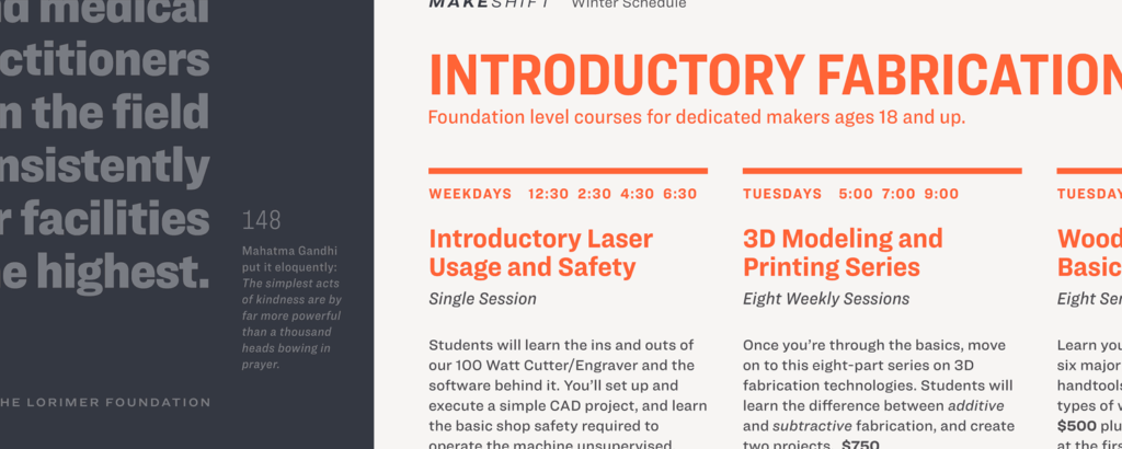
New typeface from Hoefler & Co. takes us Ringside
Graphic designers prick up like meerkats whenever Hoefler & Co. release a new typeface. And for good reason. Many of their works have become highly visible (and popular) due to their appearance in notable places. Gotham, for example, was the signature typeface for Barack Obama’s 2008 presidential campaign, and is now as ubiquitous as white bread in the branding world. It’s been used for countless movie titles and even features on various broadcast graphics on Australian television. Hoefler & Co. have just released the latest addition to their collection, and it’s a sans-serif called Ringside.

Ringside carries over the aesthetic of the studio’s Knockout typeface, but tones down the woodtype nuances that are a bit too intrusive at text sizes. Ringside offers an extended range of weights and widths, as well as italics (absent in Knockout). In total, Ringside is an assemblage of 96 fonts. Talk about a superfamily.

To avoid blandness and predictability across the family, the designers implemented different design decisions to each part to make them visually distinctive. For example, Compressed and Condensed characters feature flat sides and generally horizontal stroke endings. At the other end of the spectrum, things open up and we see fully-curved characters with diagonal stroke endings.


Like many of the studio’s typefaces, Ringside has companion “ScreenSmart” webfonts which are designed to perform superbly on screen. It’s yet another versatile addition to Hoefler & Co.’s diverse collection, and I look forward to seeing how designers execute it in the near future. Why not give it a whirl?
