Ampersands on Australian road signs
During the recent Easter long weekend, my parents and I drove down from Sydney to Wollongong for a relaxing day out. At certain points along the journey, I noticed some signs like this:

What struck me was the unconventional ampersand – it was jarring! Now I used to write the ampersand in this way, with a vertical line through it, but I have never encountered the “backwards 3” variation of the ampersand in any font or typeset material, so why is this less common variation used on Australian road signs? (Or, at least, on New South Wales signs.)
Digging deeper, our road sign letterforms are defined under Australian Standard AS1744, and based on a type family developed by the United States Federal Highway Administration (FHWA) for road signage in the Americas, commonly referred to as Highway Gothic.

Our AS1744 Series consists of six fonts, virtually identical to those above, which range in width from “B” (the narrowest) through “C”, “D”, “E”, “Modified E” (with thicker strokes) and “F” (the widest).
While the AS1744 fonts aren’t publicly viewable, we can examine the character set of the FHWA Series to see what its ampersand looks like. These are found in the Standard Highway Signs and Markings book, which reveals the following forms.

A normal ampersand! Again, why is ours different?! (Just to be clear, by “normal ampersand”, I mean the form with two closed counters, as above.)
Roads and Maritime Services, the government agency which manages the New South Wales road network, provides design plans for all traffic signs on its website. And this is where things get interesting.
The image below is from the design plan of the sign I photographed, officially called Regulatory Sign No. R6-240-1. It specifies sign dimensions and letter heights, plus it indicates the fonts used (in this case, “D” for four lines and “E” for the word “MUST”).

Further instructions indicate that the “ampersand” is actually a transformed figure “8” from the “Modified E” font! So there is no true ampersand in the character set of AS1744 fonts, at least when this sign was approved in September 2007.

The following signs also have the “backwards 3” ampersand:
- PICK UP & SET DOWN AREA (March 2006)
- KISS & RIDE AREA (March 2006)
- TRUCK & BUS SPEED LIMIT, END TRUCK & BUS SPEED LIMIT (December 2006)
- TRUCK & BUS SPEED LIMIT (October 2009)
A sign for “BUSES & TAXIS EXCEPTED” approved in May 2013, below, does have a normal ampersand, but it’s still foreign to the AS1744 character set. The design plan notes that it’s set in Arial Black; in fact, it’s actually Arial Narrow.

Here’s another sign with an Arial Narrow (Bold) ampersand.
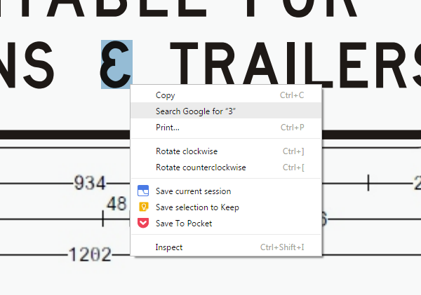
None of the aforementioned design plan PDFs allow you to select the ampersand like regular text, but this design plan for a cautionary sign, approved in June 2014, does.

When right-clicked in Google Chrome, the ampersand glyph is recognised as a variation of the “3” character. This suggests that an ampersand, however funky, has been integrated into the AS1744 character set as of 2014.
What about signs in other states? In Queensland, signs appear to use an FHWA-based ampersand, as seen on this page (scroll halfway down). The state’s Department of Transport and Main Roads also provides an interesting manual called Design Guide for Roadside Signs which details best practice for implementing the AS1744 alphabets (although the AS1744 family has been restructured since the manual’s release in 2001).
Victoria’s VicRoads agency, like Roads and Maritime Services, also provides design plans for all road signs. In its Supplement to AS1743 manual, there are some examples of signs with ampersands, all of which resemble the FHWA ampersand. Below is one such sign, which was approved in 1998.

The ampersand there has the same horizontal stroke endings, but differs in stroke thickness and the shape of its counters. Check out the slider below where I’ve overlaid the FHWA ampersand (green outline) on the VicRoads ampersand (orange).


So what have I learned? Well, of the states I’ve surveyed, New South Wales seems to be the only one that insists on using a custom “backwards 3” ampersand. It’s strange, when the AS1744 character set used across Australia is derived from another typeface that has a normal ampersand!
The Australian Standard Road Signs Specifications (AS1743) defines strict guidelines for the size and placement of signs, the size of letters, and the space between and around letters. These are calculated based on factors like driving speed, competing visual stimuli and the need for emphasis. It’s curious that the choice of glyph for the ampersand in New South Wales doesn’t reflect such stringent requirements that aim for ease of comprehension.
The “backwards 3” variation is very uncommon, and while it may be skimmed over and interpreted correctly in context, it’s an unnecessary deviation from the universally recognisable logogram seen in almost every typeface and on almost every keyboard in the world.